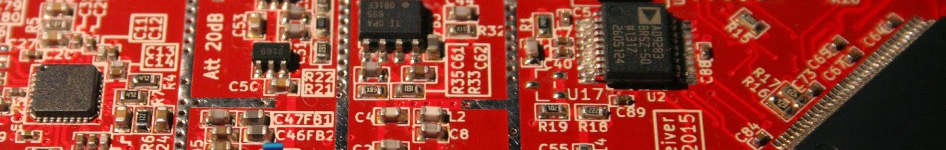
During the last days, I had the chance to record some radio astronomy data with my 1.4 GHz telescope. The receiver system is more or less unchanged compared to what I described in the last post, except that I have pretty versions of the amplifier and filter boards now:
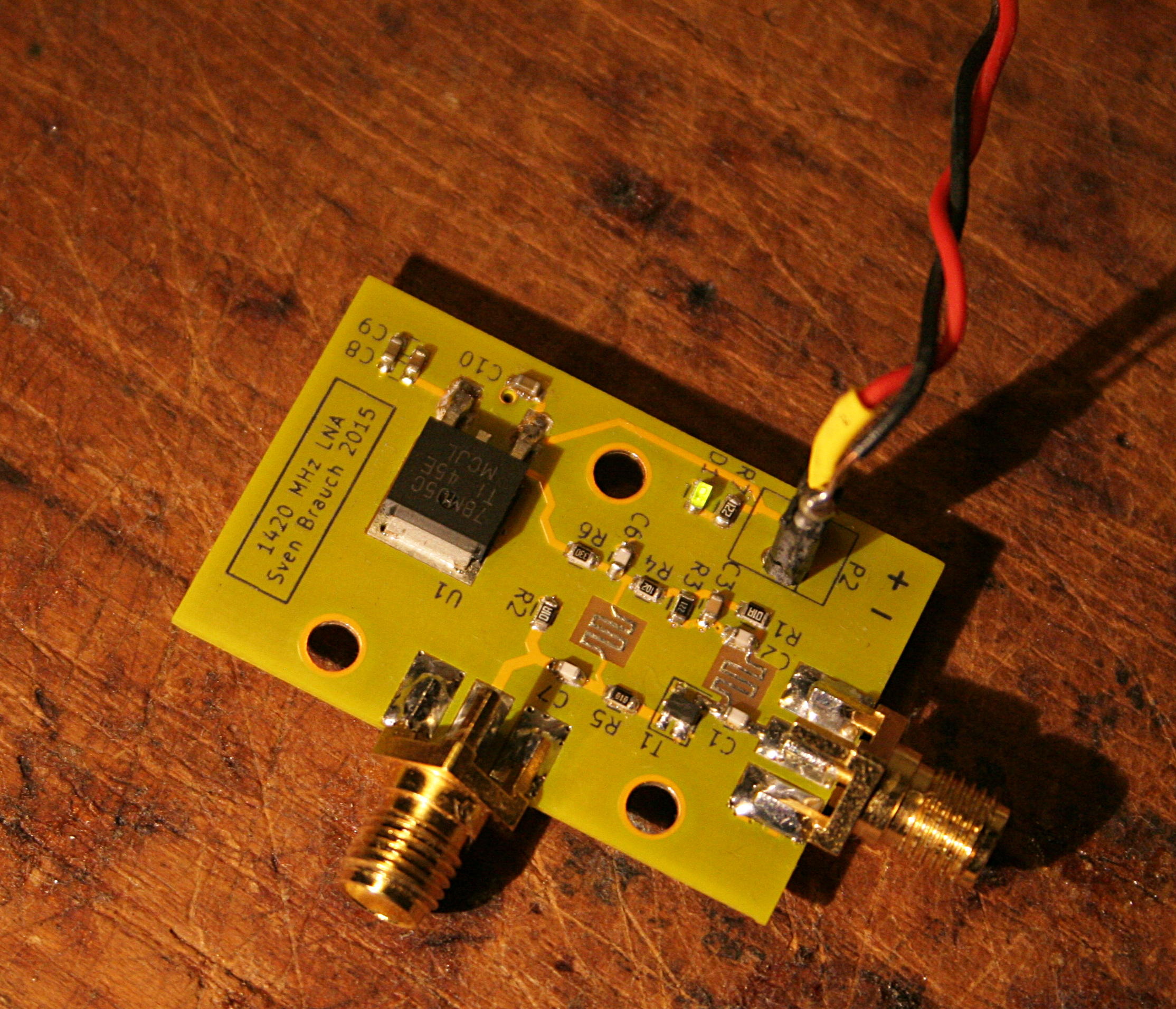
1.4 GHz Low-Noise preamplifier, pretty version. The amplifier has a gain of about 19 dB and a noise figure of something below 1 dB (I can’t measure it exactly).
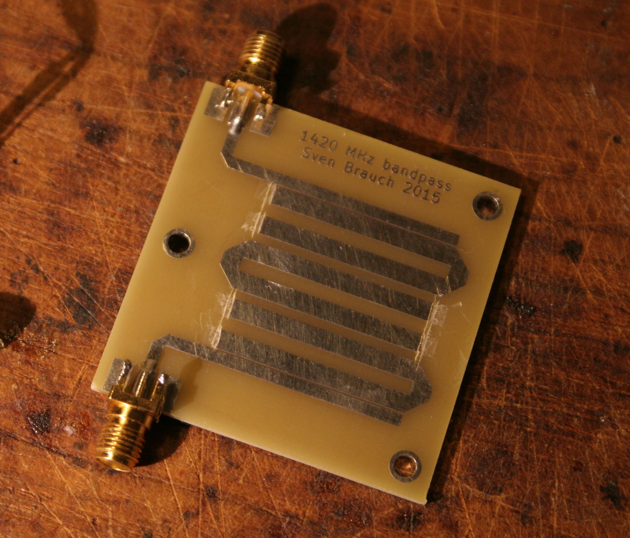
1.4 GHz bandpass filter, with a bandwidth of something around 100 MHz. Insertion loss is around 4 dB. The stubs were manufactured a bit longer than I suspected what would be the right length, and then trimmed with a knife to give the best bandwidth center.
For the measurements I performed until now, I only used a small biquad antenna without parabolic reflector. The collecting area is thus very small, but neverthereless the signal is already recognizable after about a second of integration time under good conditions.
The antenna points (well, “points”, it has an opening angle of 60 degrees) into the same direction during the measurement, which might be a whole day or so. The earth’s rotation moves different parts of the milky way through the field of view over time. By performing this measurement, one obtains a plot of intensity over frequency for each point in time, as can be seen below.
A single line of data (after on-off-calibration, see text below). x is frequency, y is amplitude (both in arbitrary units). The broad peak around the center is the HI emission. This plot contains about 200 seconds of data. The narrow peaks are RFI (Radio Frequency Interference) from human-made sources nearby.
This is not the raw data; in the raw data, the actual signal is nearly unrecoginzable because of the bandpass shape (which is basically a frequency-dependent noise floor). To remove this frequency-dependent noise floor, one can perform frequency switching: For each time, two measurements are made, one at a freqency where the signal is expected (“on”) and one where there’s no signal nearby (“off”).
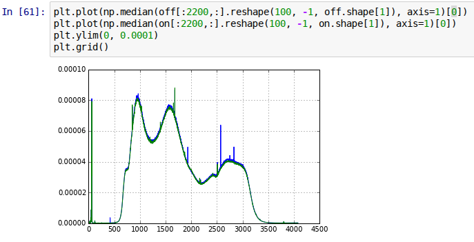
The on (green) and off (blue) curves from which the above plot was obtained by calculating (on – off)/off.
By pointwise subtracting the two signals and dividing by the “off” curve, one obtains a much clearer view on the signal.
The next step in data processing is the removal of an artifact caused by the frequency switching procedure: the “off” curve will have a slightly different base signal level from the “on” curve, because it is recorded at a different frequency. This change in the baseline is approximated by a first-order polynomial and then subtracted.
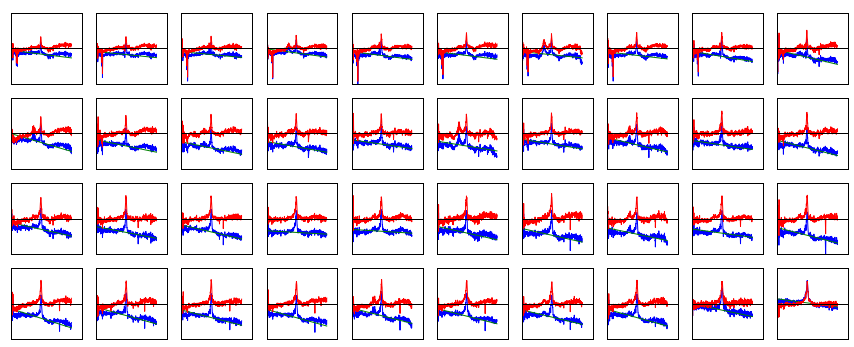
Original data (blue), fit of first-order polynomial to remove the frequency switching baseline (green), and result of the procedure (red), for different times.
Through this algorithm, one gets from this plot:
Recorded data without baseline subtracted. x is freqency (arbitrary units), y is time (arbitrary units too, the whole plot is a few hours of time).
… to this:
Recorded data with baseline subtracted.
which looks of course much closer to reality.
The last step which I perform is an RFI (Radio Frequency Interference) removal algorithm, which is so unscientific that I don’t want to describe it here. But look, the plot gets much prettier by doing that:
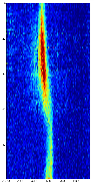
Resulting recoded intensity with most of the RFI removed. x is in km/s now, and the black line is v=0 km/s. No LSR correction was performed yet.
Here are two more data sets obtained in the same way. Each picture contains information from about 1000 GByte of raw sample data.
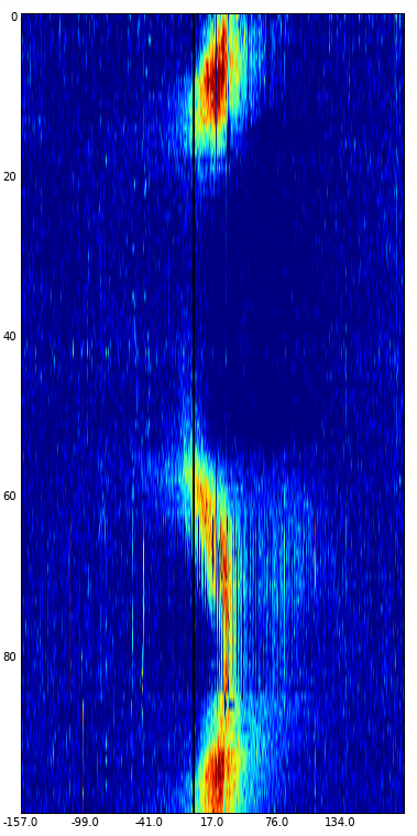
A full day of data when looking westwards. Unfortunately later on some strong RFI makes the data look not so pretty (vertical blue stripes). You can nicely see how the same signal like in the beginning appears again at the bottom of the plot when the same part of the milky way transits through the field of view.
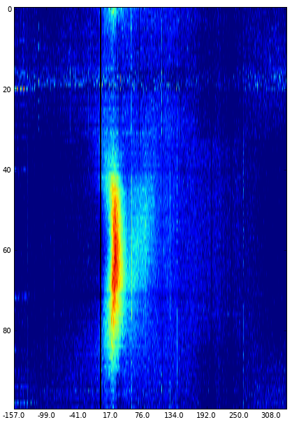
About a day of data when looking towards zenith. In this plot, one can nicely identify at least two different spiral arms of the milky way. Also observe the weak, but broad background signal which extends almost up to +200 km/s.
If you want to take a look at the data yourself, here’s the record file from which the first plot was produced (data format is timestamp – on/off – cal/uncal – 4096 spectral channels of data, in arbitrary units, all per line).
Just for the record, here’s some more stuff I found interesting along the way:
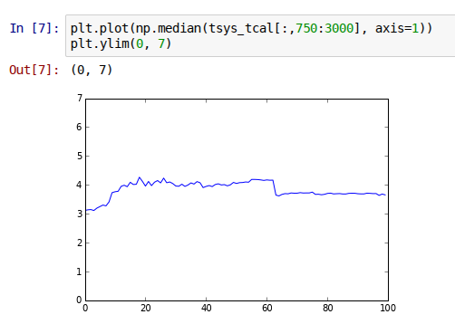
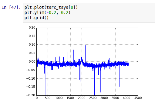
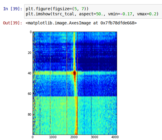
System temperature in units of calibration temperature over time (x is time in arbitrary units, but it’s several hours over the full plot, y is the factor by which TSys is larger than TCal). The whole calibration temperature thing is not working terribly well yet, so take this with a grain of salt.
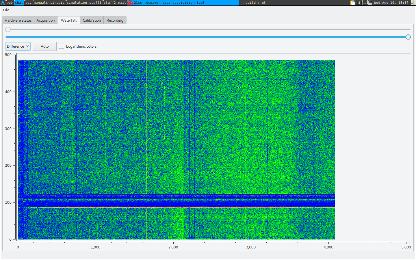
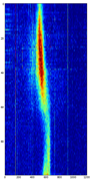
This is my data recording tool, previewing data it is currently recording. x axis is frequency, y axis is time (downwards is later time). Color encodes intensity. In this picture, you can see the milky way set; the broad green stripe around the x=2100 label is the HI line from the milky way, which disappears towards the top. The horizontal blue stripe is somebody accidentially pulling the plug of the preamplifier for a few minutes 🙂
Categories: Everything
Tags: astronomy, hardware, hydrogen line, interferometry, radio telescope
I was wondering if I could get the cad files and the schematics of the boards to build a set myself?
Sure, here they are: http://files.svenbrauch.de/h1telescope/
It’s a difficult project though, even with the CAD files. You need lots of equipment and some expertise in assembling this kind of stuff. Let me know about your progress if you should give it a try, would be interesting! Good luck 🙂
Hi, I’m interested in building a radio telescope for hydrogen line and I have some doubts. I am in doubt about mounting the LNA and bandwidth filter.
Hm, that’s not much to work with for helping you 😀 What is your problem specifically?
Hello!
What are the best RF filter options?
What to choose when calculating?
Bandwidth?
Sorry for my English! (
For this specific application? I think the microwave filter design presented here isn’t bad. If you could find one, you could also use a SAW filter. But I’m not really an expert in these things.
I’m just starting to study the telescope. I am a hardware developer RF.
I wanted to make a good LNA and filter the signal.
At this stage, I cannot understand bandwidth filter .
Bandwidth
100 MHz or you can use, 20, 10 MHz. It seems to me a narrower filter is preferable.
Please give some good advice!
Which program do you use to get this data? Could you send it?
It will be of no use to you, it is completely specific to this setup, talking to a custom USB device in a custom protocol, etc.
Hello. I’m interested in building the 1.4 GHz preamplifier and filter but don’t know how to open the files, can you help? I’ve tried opening the files in KiCad but haven’t had any luck. Thank you.
Hi, did you download the preamp-cache.lib file and place it next to the downloaded schematic? Kicad needs that file to import old library symbols in new program versions.
Hello, when I try to download the preamp-cach.lib file it opens a new tab with lots of text and numbers. Do I need to copy and save that text somewhere and try to open that in Kicad?
Right-click and “Save file” on each file in the list. Then open the .sch file with kicad’s eeschema. So yes, kind of, but “Save file” is easier.
Yes that worked. Thank you for the help.